

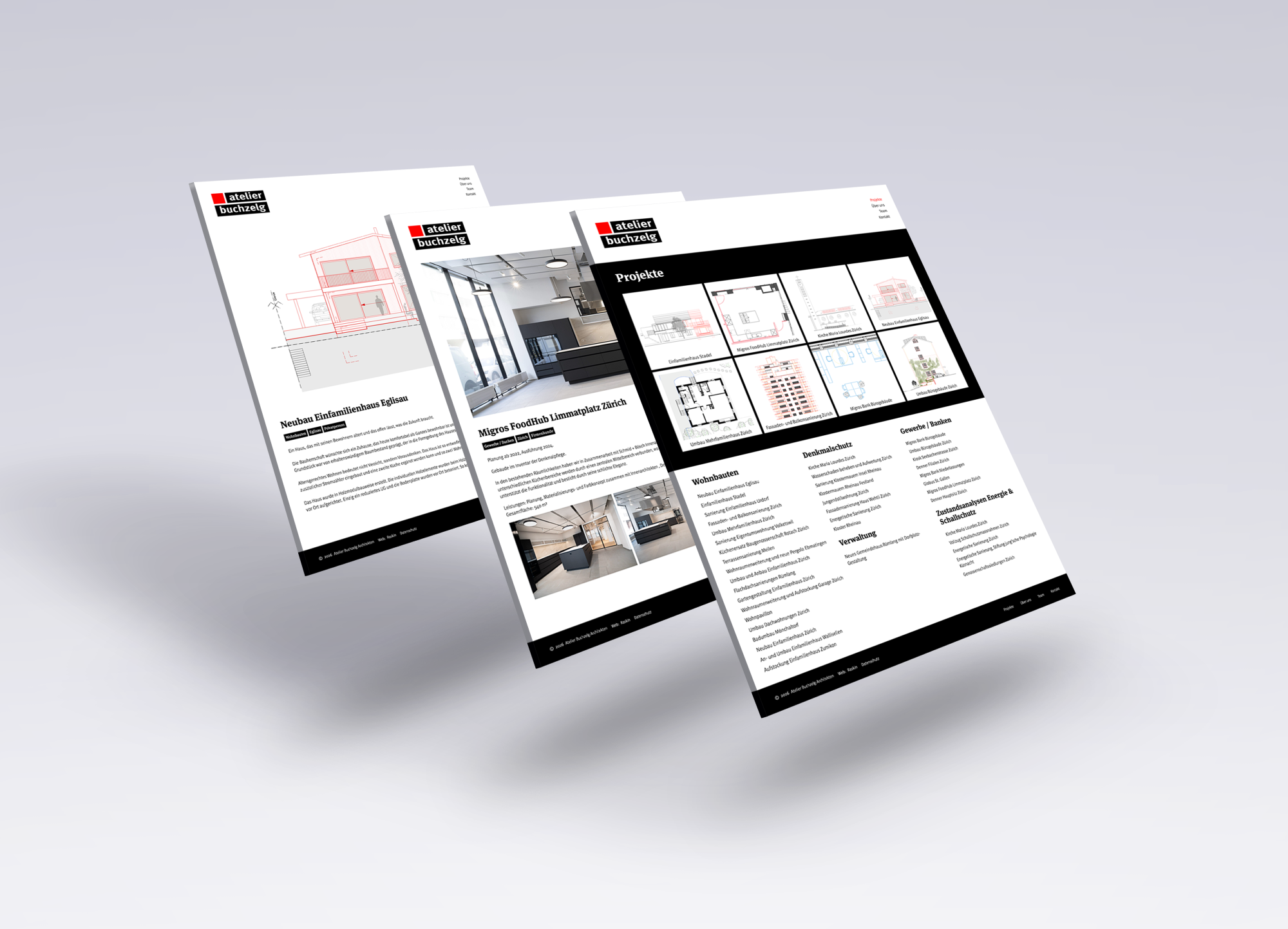
Plans Instead of Glossy Images: The New Website of Atelier Buchzelg Architects
How we designed a website for a Zurich-based architecture firm that emphasizes substance over form, in keeping with the guiding principle: Architecture that works. From the first sketch to the final inspection.
The Starting Point
Atelier Buchzelg Architekten has been designing and building in the Zurich area for years: single-family homes, renovations, historic buildings such as the Maria Lourdes Church, as well as retail locations and office buildings for large companies. Their work was outstanding, but their website was not. It was outdated, poorly designed, and failed to convey the quality behind their projects.
On top of that, there were two challenges. The team is already working at full capacity, so there simply wasn't any time for a lengthy website project. In addition, many of the older projects lacked professional photos.
Who the website is intended for
Before we began the design process, we took a close look at our target audiences. Two groups are central to our focus. One consists of homeowners in the Zurich area: people who are building new homes, remodeling, or renovating, and who place a high value on quality and meticulous workmanship. The other consists of institutional clients such as property management companies, cooperatives, or businesses that are responsible for construction projects, even if they do not own the property themselves.
As different as these two groups may be, they share the same expectation: good design and solid execution go hand in hand. Proportion, materials, and atmosphere are important to them, but a design must also be technically sound, within budget, and executed with precision. Beautiful images alone do not convince them. What counts is architecture with high design standards, combined with expertise, attention to detail, and a construction management team that keeps the project under control until final acceptance.
The Idea: The Plan as a Visual Language
It all began with thorough research. We analyzed numerous architecture websites in the Swiss market. Many of them rely almost exclusively on photos, which quickly makes them seem cluttered and indistinguishable from one another. For Atelier Buchzelg, we wanted to find a unique message that would suit the firm and its target audiences.
This led to the solution for the lack of visual material. Instead of relying entirely on glossy photos, we made plan details the central design element: floor plans, sections, and details. They show what the target audiences want to see—namely, that the planning here is done with precision. The result is a calm, distinctive look that clearly sets the firm apart from other architecture firms.
This way, even a project without photos can be presented effectively, and the archive—with its numerous references—finally becomes visible.
Do-It-Yourself Team Photos
An architecture firm thrives on its people. That’s why we created team photos based on a clear, simple concept. The lighting, framing, and style are defined in such a way that the firm can photograph new employees on its own in the future, without needing a professional photo shoot and without the website looking inconsistent.
Streamlined Process, Strong Results
Because the team’s time is limited, we deliberately kept the process streamlined: a few well-prepared coordination meetings, clear decisions, and no endless feedback loops. The result is a website that captures the firm’s promise in a nutshell: architecture that works. From the first sketch to the final building inspection.
"We now have a great new website without having to invest much time ourselves. We were most concerned about the images, but that’s been handled really well. The team is also thrilled with the new team photos. It’s a fresh new look that really stands out."
Jonas Weber, Managing Director and Construction Manager, Atelier Buchzelg Architects
